


The size of 3D letters according to viewing distance is not decided from how the logo looks on a screen. It is decided from the actual reading position: the pavement, the street opposite, or a mall entrance, and the speed of the person who sees the facade. This guide helps you estimate letter height according to viewing distance, then review the remaining factors before you approve manufacture with FACO.
This guide does not repeat the choice of material or lighting type; that is explained in how you choose letter material and lighting direction. The focus here is only on size and reading distance.
In short
- First define where the name will be read from: the pavement, across the street, or a wider road.
- Use the preliminary estimates as a starting point for review, not as a final figure to apply to every facade.
- Contrast, stroke weight, lighting and traffic speed may require a letter larger than the preliminary estimate.
- FACO reviews the size with a facade photo and the viewing distance as part of a request for illuminated 3D letters in Riyadh, Qassim and all regions of the Kingdom.
Why is approving the size from the design file not enough?
The design shows the name clearly because it is displayed close to the eye. On the facade, a greater distance, a different viewing angle, and perhaps a moving car or overlap with building elements all come into play. A letter that looks balanced in the mock-up may become hard to read if it is executed smaller than the site distance requires.
Not every word in the logo is equally clear either. Arabic letters with dots and fine parts need a special review; a small detail may disappear before the overall structure of the name does. That is why the size is reviewed on the approved text itself, not on a short test word.
Start by defining the viewing distance, not the letter height
Ask one question before any number: where does the person who needs to read the name stand or pass? Photograph the facade from that point if you can, and estimate the distance approximately. Then distinguish two levels of reading:
- Reading the name clearly: the visitor can make out the writing of the name or the activity.
- Recognition from a distance: the shape or logo catches their attention before they read every letter.
Mixing the two levels leads to a letter that is larger than needed, or to a letter that looks elegant in the image but is not read at the right time. Define the required level for each element: the name may need clear reading, while a decorative element in the logo may be enough for recognition.
A preliminary estimate of letter height by viewing distance
The figures below are common preliminary estimates for review, not a binding specification and not a guarantee of clarity at every site. Actual conditions may require an increase in height, especially with weak contrast, a thin typeface, or reading from a moving car.
| Approximate viewing situation | A common reading distance | A starting point for letter height | A note for review |
|---|---|---|---|
| The pavement in front of the shop | Up to about 10 meters | About 8 to 12 cm | Review contrast with the facade more than exaggerating the enlargement |
| Across the street or from a nearby car park | About 15 to 30 meters | About 15 to 30 cm | Reduce the words in the distant layer and focus on the name |
| A wider road or a mall entrance visible from far away | About 40 meters or more | About 35 to 50 cm or more, according to the site | Reading from movement usually needs a clearer height and higher contrast |
These ranges are not a fixed calculation formula. If the typeface is thin, the color is close to the background color, or the name is read at night under weak lighting, start from the larger side of the range or increase it after a site review. And if the shop is seen from more than one distance, design the distant layer for the short name, and leave the detail for a closer distance or the entrance.
Factors that adjust the size after the preliminary estimate
Contrast and background color
A medium letter on a high-contrast background may be read better than a larger letter on a color close to it. Review the color of the cladding, glass or paint with the face color of the letter by day and at night. The guide to shop-facade cladding is useful when the background is part of the clarity decision.
Typeface shape and logo details
Thin typefaces, closely spaced letters and fine details inside the logo weaken faster as the distance increases. If the letter cannot be enlarged because the facade area is tight, simplifying the execution or increasing the stroke weight may be more suitable than insisting on every detail in the original file. Review preparing a logo to be produced as 3D letters.
Lighting and the time of reading
Size alone does not make up for a name that disappears at night. If evening reading matters, lighting is reviewed with the size, not after it. The type of front or halo lighting is an independent decision explained in the material and lighting guide, but its effect appears on clarity from the same distance.
Traffic speed and viewing angle
Someone walking on the pavement has more time to read than a driver on a main road. The shorter the viewing time, the more you need a shorter name and a clearer letter. Columns, trees and the approach angle also have an effect; the straight-line distance on the drawing may not be the actual line of sight.
Facade width, not letter height alone
A long name on a narrow facade forces you to reduce the letters. In that case, review the content before the size: shorten the distant layer to the main name, and move the detailed activity or the contact number to a closer position. Increasing the number of words while keeping the same distance usually leads to a smaller letter and weaker reading.
How do you review the size before manufacture?
- Define the main reading point and photograph the facade from there.
- Estimate the distance, and choose a starting range from the table above.
- Place the approved name on the actual facade width, not on an isolated square mock-up.
- Review the longest word and the finest detail in the logo at that height.
- Test the contrast by day, and anticipate the nighttime look if lighting is within the scope.
- Confirm the fixing method on the existing surface, cladding or glass before you approve the final size, as in the guide to installation on different types of facade.
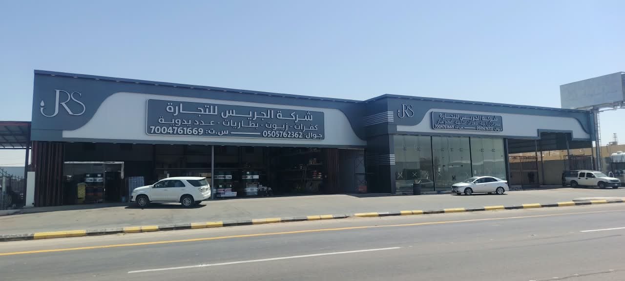
Photos of previous projects help you understand the style of execution, not to copy the size letter for letter. For example, the Al-Jrais facade documents letters on a commercial facade seen from the street; the benefit is in reviewing the relationship of the name to the facade area, not in applying the height to your site.
A checklist for 3D letter size
- Define the main viewing point and its approximate distance.
- Distinguish clearly reading the name from visual recognition from a distance.
- Enter the preliminary estimate, then adjust it according to contrast, typeface, lighting and traffic speed.
- Test the longest approved text, not the shortest wording.
- Make sure the facade width can take the name without a reduction that weakens reading.
- Link the size to the fixing surface and the power path if the letters are illuminated.
- Approve the size in writing within the specification before manufacture.
What should you send FACO to review the size?
- Photos of the facade from the usual reading distance, and a closer photo of the surface.
- The approximate facade width and the height of the installation position.
- The logo file and the Arabic and English text if they exist.
- A description of the shop’s location: on a pavement, a street, or inside a mall.
- The city of execution, and whether lighting is included in the request.
FACO then reviews the size with the rest of the letter specification in the works quote. For material and lighting details, review the dedicated guide, and for preparing the file review the logo guide, then send the request through the contact page.
Frequently asked questions
How do you choose 3D letter size for your shop facade by viewing distance?
Start by defining the reading point and its distance, then use a preliminary estimate of letter height, and adjust it according to contrast, typeface shape, lighting and traffic speed. The final size is approved after the name has been placed on the actual facade.
Is there a fixed formula that calculates letter height in meters?
There is no single formula that works for every facade. Preliminary estimates help start the discussion, but the site, the typeface and the lighting may change the result. Do not rely on a ready figure from a table without reviewing photos of the facade.
Is a larger letter always clearer?
Not always. If contrast is weak, the name is crowded, or light reflects on the face, enlargement may not solve the problem. And sometimes the facade width is tight, so a large letter compresses the spacing between letters and weakens reading.
Does the size of Arabic letters differ from English?
Arabic text may need an additional review because of dots and closely shaped forms, especially in thin typefaces. If the two languages sit on two lines, review the space for each so that one is not reduced more than necessary.
Is the size fixed before the material and lighting are chosen?
The size is estimated first from the viewing distance, then reviewed with the material, lighting and fixing because these elements affect the final clarity. Do not completely separate the decisions, and do not postpone the distance until after manufacture.
Does FACO execute 3D letters outside Riyadh?
FACO reviews and executes letters and signs in Riyadh, Qassim and all regions of the Kingdom, according to the project location. Send photos of the facade, the approximate distance and the city through the contact page.
A last point before approval
Do not approve the size from a design image enlarged on a phone while you are standing in the office. Go back to the viewing point at the site, or to a photo taken from there, then ask: is the name read at the moment the visitor needs it? If the answer is uncertain, review the height, the contrast or the amount of text before the manufacturing order.